
You want graphs? On Thanksgiving? Shouldn’t you be eating and or sleeping?

Fine. You want graphs, you’ll get graphs.
How about a graph from the Bureau of Travel Statistics about the travel patterns during the week of thanksgiving?

Or maybe one graphing turkey consumption around the world?

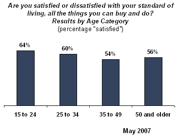
How about a graph from a Gallup poll taken in Turkey?
You wanted original content? Too bad. I’m eating turkey.
I understand that the Year-round daily average is for comparison, but I think more useful would be the actual averages on each individual day rather than the average split across all days. What does a Thursday look like on average? Wednesday? C’mon, BTS.